Print & Digital Design
The Iranian American Women Foundation (IAWF) was founded in 2012 with the mission of empowering professional Iranian-American women through networking, mentorship and scholarships.
The brand needed a cohesive, modern, and impactful visual presence that truly reflected the foundation’s focus, for print and digital assets.
My Role: Brand Refresh | Graphic Design | Brand Guideline | Print Design | Social Media Design
Team: Founder | Execution Team
IAW Foundation Vision
The Iranian American Women Foundation offers rising leadership programs, mentorship opportunities, and scholarships for young community members.
They host programs, conferences, workshops, and networking events in major cities like Los Angeles, San Francisco, New York, and London, they extend their impact globally.
A forward-thinking, trust-worthy, and energetic organization that showcases the foundation's expertise in mentorship and scholarship programs, while promoting their events.
4 key Audiences
Professional women, in the community, who participate in and benefit from leadership programs, workshops, and networking opportunities.
Donors, who support the organization's mission financially
Mentors and volunteers, who dedicate their time and expertise
Mentees, who are young professionals and benefit from the mentorship and scholarship programs
Expanding the Brand’s Visual Language
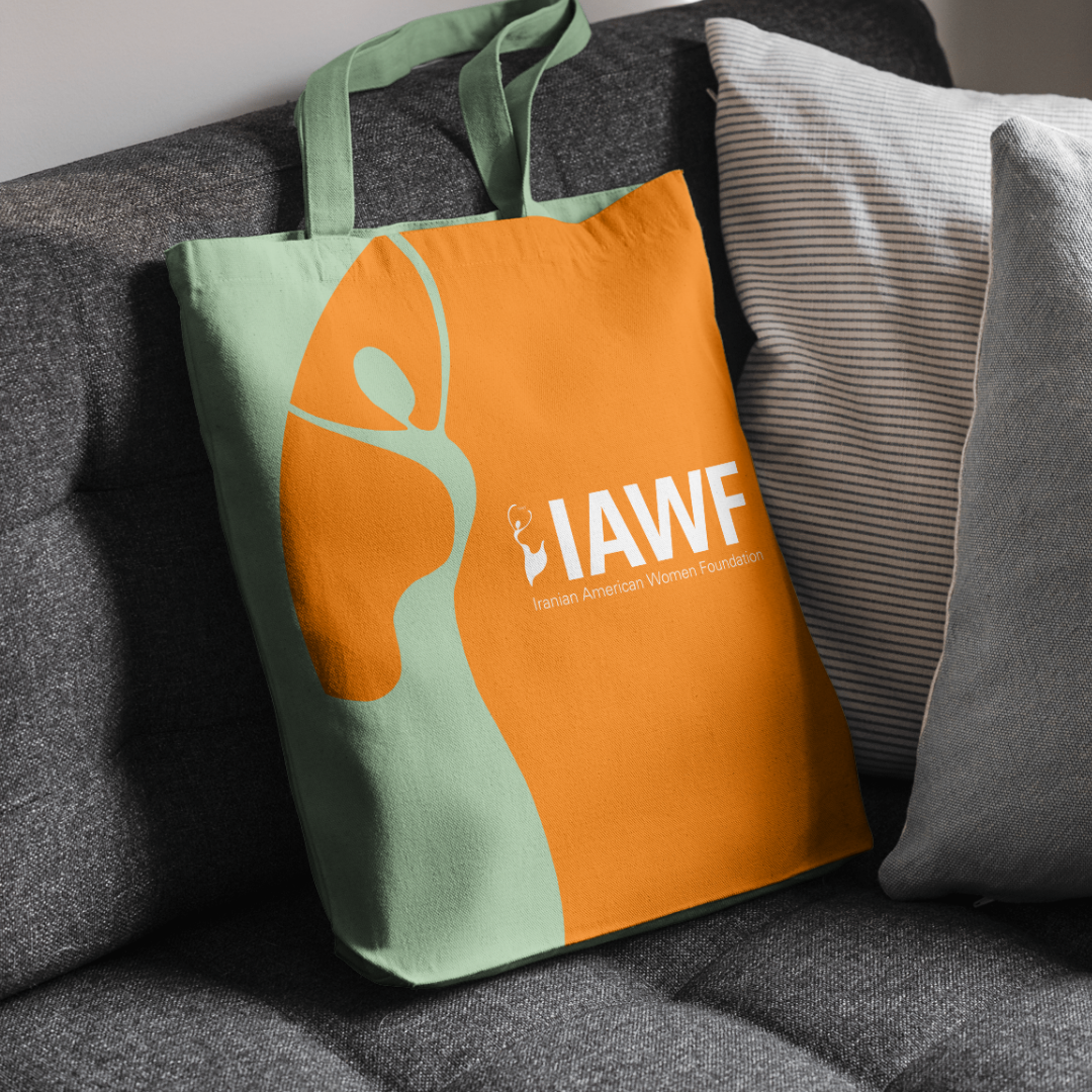
The brand’s logo is a well-established symbol, instantly recognizable with its signature orange. It embodies confidence and energy while maintaining an approachable, feminine, and global appeal.
To extend the brand’s visual identity, I incorporated soft, curved shapes inspired by the logo’s form. I designed graphics influenced by traditional Iranian paisley patterns and organic elements like ginkgo leaves—symbols of hope, resilience, and stability. These elements work together to reinforce the brand’s balance of femininity and strength.
Style Board
Expanding the Color Palette
Building on the brand’s signature orange, I introduced complementary shades of green to represent growth, along with lighter and deeper variations of orange to add depth and versatility.
Annual Report Booklet
I designed an 85-page annual report that showcases the foundation’s key activities in 2023 and 2024. I ensured a cohesive and engaging layout that reflects the brand’s identity while maintaining clarity and readability.
Takeaway
Expanding the brand’s visual language—while staying true to its core identity—allowed for greater flexibility and consistency across different touchpoints. Through thoughtful design choices, I reinforced the brand’s mission and values, ensuring its story was visually compelling and emotionally resonant. This project reinforced the importance of balancing creativity with strategic intent to create a cohesive and meaningful brand experience.


